Content: The magazine contains four pages, this includes a front cover, a contents page and a double page spread. Because the magazine will be released quarterly, the magazine has a different theme according the season the magazine is released in, the magazine I have creating will be the “SUMMER EDITION” which is why magazine’s content is summer themed, which is why all images have been taken on a sunny day.
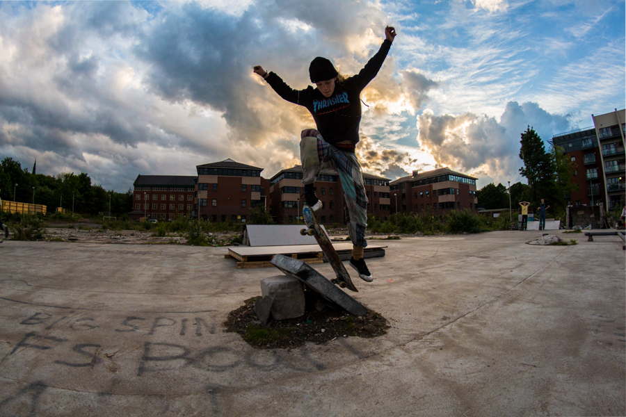
Cover Page: The cover page’s main image, contains a photograph of Isaac Green performing an a jump of a ramp. The shot was taken whilst Isaac is in mid-air, with the sun beginning to set in the background, creating an action shot spectacle. The location of the image, was in Quick Fit, a rural/popular skate location in Sheffield.
The picture was taken using a fish eye lens in order for the stunt to appear more extreme and like a real skate magazine, a fast shutter speed was also used in order to capture the image without the Isaac appearing blurred, and the ISO was low since there will be plenty of light from the sun light entering the camera. The images aperture was also very wide, in order to capture the recognisable/rural landscape of Sheffield.


For the males readers, the skater featured will appeal as an ideal self, since amateur skaters will want to be able to perform the way the featured skater is, therefore persuading them to buy the magazine, hoping that it will improve their abilities. For females readers, the skater will appeal as an ideal partner, since if they are interested in skating, they would perhaps want a partner to be a skate too.
Because the sun is setting, the sky looks very beautiful and successfully creates an appeal for going outside and skating in the summer. Also, the skaters outfit clearly shows that he is a skater, therefore he should be wearing skater clothes such as “THRASHER” or “VANS”. His trousers should also be torn in order to fit suggest that Isaac has an extreme sports lifestyle. This links to McQuail’s theory (1972), that suggests that audiences form their personality based on their inspirations outfit. Therefore the target audience should aspire to dress like Isaac.
The pages masthead is below the magazine’s slogan and reads “NO COMPLIE” in the colour red in Heroes Assemble font. The mast head is also the largest text on the page to connote the importance of the brand.
The cover page links to the double page spread, with a bold title reading “ISAAC GREEN in QUICK FIT”, therefore audiences that like the look of the title they are going to be inclined to buy the magazine in order to read the article.


The title’s font is “Heroes Assemble” which is the font which is used through out the entire magazine for titles in order to create synergy, the title looks like it is a skate ramp because it is curved in order to appeal to the sub-genre of skating, and is also a blood like red in order to connote the appealing danger that skating offers.

The titles on the cover page also includes a plug which outlines a competition in which the reader could win a DeathWish skateboard, which is a competition designed specifically to appeal to a skating audience. Above the title, in bold writing there is a slogan/description reading “SHEFF’s NO1 SKATE AND BMX MAGAZINE” which shows the reader exactly what the magazine is about. This creates a direct appeal to the audience, through emphasising the titles through the size, therefore the title is the largest followed by smaller text which contain less important details.

The titles on the cover page also includes a plug which outlines a competition in which the reader could win a DeathWish skateboard, which is a competition designed specifically to appeal to a skating audience. Above the title, in bold writing there is a slogan/description reading “SHEFF’s NO1 SKATE AND BMX MAGAZINE” which shows the reader exactly what the magazine is about. This creates a direct appeal to the audience, through emphasising the titles through the size, therefore the title is the largest followed by smaller text which contain less important details.
The cover page also contains another title graphic which links to the article on BMXing called “BMX AIR AT MILLHOUSES” which is another popular extreme sports location in Sheffield. The magazine has a large cover line reading “SUMMER EDITION” in order to make it clear to the audience that the magazine’s theme is summer.

The image also promotes Sheffield as a location for skating, and will also make it clear to the reader that the magazine’s genre is an extreme sports magazine. So that I made it clear that this is the magazine’s genre, it is important that the title also shows this, therefore the title’s font and colour scheme will connote ideas of danger, and being extreme. Therefore, the title’s colour is a blood like red, and the title’s font, “heroes assembled” will be edited so that the title appears like it is moving at high speed by bending the letters all on one direction. This way the magazine appeals to the audience who BMX as well as the audience who skate since both sports involve moving at high speed.
Contents Page: The contents page features images of Sheffield’s landscape during the sunset in order to have a clear background for the contents to fit in, with the silhouette of someone skating in mid air layered on top.
The list of content includes the main article featuring Isaac Green, and the article with Jason Fried on the BMX, the contents page also includes more details on how to enter the competition mentioned on the cover page. The same mast head is used again in the contents page, however it is not as large as it is on the cover page. The mast head is surrounded by text so that the mast head reads “THIS SUMMER IN NO COMPLIE” in order to establishes the fact that the magazine is a summer edition in order for the magazine to be more successful at the time, the mast head is also followed by a smaller title which reads “ISSUE #1” specifying that the magazine is the first of its kind, making the magazine seem more unique.

The contents page also also contains an editor’s note, from me, which addresses the target audience in a peer-to-peer tone, and explains to them that the magazine is local to Sheffield and is there to help budding skateboard/BMX users improve. The contents page also includes a title graphic reading SKATING TIP which is followed by a way in which skaters can improve their abilities.
The contents page also features a small graphic of a skater above the sillhouete of Sheffield, to connote that Sheffield is a great place to skate in, which is the purpose of the magazine, to appeal to the sub-culture of skaters in Sheffield, and also to appeal to to people that might consider visiting Sheffield.


All content mentioned in this page comes with a page number for the reader to use.
Double Page Spread: The main article links to the cover page, featuring a similar image, however one that was taken a moment after Isaac completed the stunt, making him appear even more mid-air. This way the cover page and double page spread link together in order, showing separate moments of the stunt. The Mast head reads ISAAC GREEN in QUICK FIT making it clear to the reader that the article is promoting both the local skater and the local location, and ultimately promoting Sheffield. The article discusses Isaac’s inspirations and motivations for skating, and also discusses why Sheffield is a great location for skating, how it has affected his lifestyle and how he has progressed over time at skating. This way the reader feels as if he is personally getting to know Isaac as a person, and should also be inspiring the reader to want to skate more, this is why the article is written in a peer to peer format.


The bottom of the cover page contains the NO COMPLIE title again, however much smaller, followed by the title’s page.
Measurements:
BLEED – Height: 250mm, Width: 181mm.
TRIM – Height: 247mm, Width: 178mm.
SAFE – Height: 171mm, Width: 160mm.
Distribution and marketing methods: My magazine will be released quarterly because the magazine has quite a niche audience, and wouldn’t need to be released monthly. Each magazine per year will be themed according to the current season, ie a spring edition, a summer edition, an autumn edition and a winter season. I will leave free copies of the magazine in skate shops in Sheffield such as Slugger, because that is the exact type of shop the target audience will go in. I will also leave free copies in other shops in Sheffield that sell clothing which appeals to the target audience.