Sunday, 9 April 2017
Saturday, 8 April 2017
LO4: Exporting final magazine pages
Exporting the double page spread and contents page on Adobe InDesign.
When I created my product I used the software Adobe InDesign, which is professional industry standard software, which allows you to create very professional pieces of work. During the exporting process, the settings I used were Adobe PDF for print, since that file type is designed specifically for a product which is going to be printed, meaning that on the file (including images, graphics and text) will be completely lossless and very high quality, meaning that final printed product will have a really high resolution, which is vital, since one of the purposes of the magazine is to is to show the visual appeal to skating, through beautiful photography, and the only way for photography to be properly appreciated, is through high quality images.
Exporting the Cover page on Adobe Photoshop.
When I created the cover page, I used Adobe Photoshop, another industry standard software, which I used instead of Adobe Indesign, because the page didn't contain an article, and didn't need to be arranged with columns, trim, safe and bleed area. I exported the file as a .tif, since tif files are another file type which are used in the print industry, since that file type is completely lossless, and is a huge file because of all the information contained.
Evidence of exporting photographs as JPEGS.
When I exported these photographs to use on my pages, I made sure that I exported them as JPEG's in order for the files to be lossless, in order to be high enough quality for a magazine which is going to be printed.
The way my magazine will be distributed, will be through leaving copies of the magazine in local Skating shops in Sheffield, such as Slugger Skate Store, and other shops in the Forum in Devonshire Green, which sell products which appeal to the niche audience of Skaters in Sheffield, as well as people that don't skate, but like to indulge in the skating sub-culture in Sheffield, which can also be associated with the Indie/Alternative sub-culture which is currently very lively in Sheffield.
Thursday, 6 April 2017
LO4: Client and questionnaire feedback
https://www.surveymonkey.co.uk/r/PWRC8M3
Strengths:
Good design on Masthead, good range of photography, including techniques allowing audience to see the model from different perspectiveds, good typeface used to create synergy establishing my brand.
Weakness:
Use housecolour styles from from front page and consistenntly use font styles in order for text to be easier to read.
Tuesday, 4 April 2017
LO4: Evidence of editing
Before editing:
After editing:
Before editing:
After editing:
Editing Process:
When using InDesign, in order to rotate the image of the skateboard which could potentially be won by the reader (on the contents page), I used the select and rotate tool in order for the image to fit into the magazine in a more alternative and quirky style.
On the double page spread, InDesign allows you to create a black square, which allows you to add text to the squares. This fits the brief since the most skate magazines use this format to contain text on the double page spread.
Monday, 3 April 2017
LO4: Subediting
Based on what my partner has written, I need to add an introduction, a title, and I also need to write much more.
Sunday, 2 April 2017
LO4: Version controls
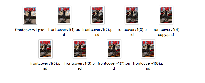
Version Controls for Cover Page:

The file types .psd has been used in order for me to be able to continue editing the file each time. psd files contain all the original jpeg/raw files which means I am able to edit and use high quality lossless files. Because each file is so lossless, they are huge in file type, however they can be easily accessed and edited when using a high spec editing machine such as an iMac. Saving each file separately allowed my work to be organised, since if there was a change I regret making to the magazine, I can go back to one of the versions and bring what I didn't want to change into a newer version of the magazine.
Version Controls for Contents Page and Double Page Spread:
The file types .indd mean that I am allowed to edit the InDesign files each time I decide to change something in my contents page and double page spread. Instead of having all the photos contained in the file, InDesign files source the images in a similar way to Adobe Premier, when it sources the video files. This way there is zero compression on any of the photos/graphics, meaning that the file types are completely lossless, meaning that they will be of a very high quality, which is important since this is a print file.
Saturday, 1 April 2017
LO4: Review of assets
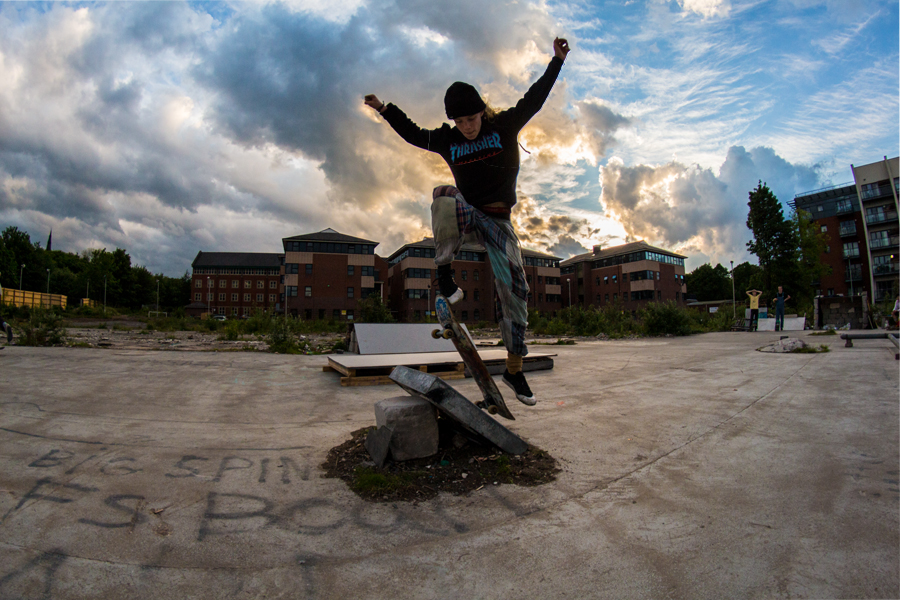
This is the first piece of photography I used in my magazine, for my photography. During editing, I managed to bring out the colours of the sky to appear more pretty by making the colours contrast more. The image creates a spectacle of the skate trick Isaac is performing and will make amateur skaters want to learn how to skate more. Isaac's costume is also what skaters wear, which makes the image appeal more to the sub-culture of skating. The image will work brilliantly as a cover page, since it allows room for titles to surround Isaac's figure, and the top space will allow the mast head "NO COMPLIE" to fit perfectly. To improve the image, I would have taken the photo at a lower angle in order for the stunt to appear more extreme.
This image was taken a moment after the previous photo was taken. This was because I was using the rapid shutter option on the Canon DSLR 650d. This image will work well because like the above photo it creates a spectacle out of the skating trick, and appeals to the sub-culture and target audience for the same reasons. The reason this picture works better for a double page spread is because the image works well as a wide photo. I would have improved this photo by moving the camera along with Isaac, creating an image with a blurred background showing Isaac's movement, with him in mid-air perfectly in focus.
This is my masthead. I used the colours black and red because those are the colours which are mainly used in the types of magazines I looked into for inspiration for NO COMPLIE. The colours are also both very bold and will stand out on any page, and the colours also link to themes like injuries and danger that skating offers. Using adobe photoshop, I was also able to give the title an effect which curves the title, making it look like a skating ramp, linking to the magazines genre and main theme (skating). The way I would improve this asset, would be by editing the image less sloppily, since on some letters, you can that the outline has disappeared (an error due to warping the texts shape).
This is the graphic I have used for features on the magazine such as the competition, since it draws attention due to its star shape, and the glowing effect, which connotes that there could be potential "treasure" in that area of the page (The treasure being the prize). The way I would have improved this graphic, would have been by drawing the image with more un even spikes, in order for the graphic to fit in more with the style of the rest of the magazine in order to create synergy.
This is the graphic I used for the contents page, since the image didn't fit the magazines genre without a visual reference to skating. The image is a clear representation of the stereotypical skater, which can appeal to incredibly wide audiences because of the fact that the figure has no face, meaning the audience can imagine themselves being the skater (since the skater is their ideal self). The way I would have improved this graphic, would have been incorporating a reference to NO COMPLIES brand, by perhaps having the the initials NC printed on the graphic, connoting that the skater is wearing NO COMPLIE as a brand, which could be a possibility if the magazine progresses.
This is the graphic I used as a background for most text on the magazine. Because it is bold and black, it supports text (which isn't black) in a which which makes the text bold and stand out. I would have improved this graphic by making it a shape which is more relevant to the genre of skating, for example the shape of a ramp.
Subscribe to:
Posts (Atom)