The desing below is a rough idea of what the front cover will look like. Using photoshop I incorporated a sketch I drew of Isaac Green skating, linking to the main double page spread I will be creating.

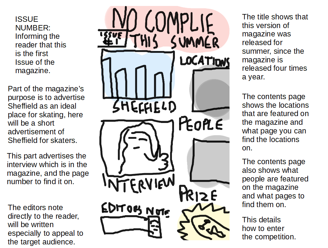
This visualisation diagram is for the contents page and was cretaed using a graphics tablet. The page will also feature a subscription at the bottom of the page, where it will detail how to subscribe to the magazine. The headers will be on black squares in a similiar style to the visualisation diagram above with white bold headers on top of them.
The design below is a rough idea of what the main double page spread would look like. The idea is to take a picture of Isaac Green performing a skate trick using a fish eye, in order to make the image appear more dramatic and look like a proffesional skate magazine, since most skate magazines like slugger use photography taken with fish eye lenses.

The diagram below is for the second double page spread, which is the BMX article based in Millhouses a location for both skaters and BMX. The sketch was created digital and drawn using a graphics tablet.

No comments:
Post a Comment