Saturday, 1 April 2017

LO4: Review of assets


This is the first piece of photography I used in my magazine, for my photography. During editing, I managed to bring out the colours of the sky to appear more pretty by making the colours contrast more. The image creates a spectacle of the skate trick Isaac is performing and will make amateur skaters want to learn how to skate more. Isaac's costume is also what skaters wear, which makes the image appeal more to the sub-culture of skating. The image will work brilliantly as a cover page, since it allows room for titles to surround Isaac's figure, and the top space will allow the mast head "NO COMPLIE" to fit perfectly. To improve the image, I would have taken the photo at a lower angle in order for the stunt to appear more extreme.


This image was taken a moment after the previous photo was taken. This was because I was using the rapid shutter option on the Canon DSLR 650d. This image will work well because like the above photo it creates a spectacle out of the skating trick, and appeals to the sub-culture and target audience for the same reasons. The reason this picture works better for a double page spread is because the image works well as a wide photo. I would have improved this photo by moving the camera along with Isaac, creating an image with a blurred background showing Isaac's movement, with him in mid-air perfectly in focus.


This image was taken for the contents page, in order to establish that the magazine is targeted at the sub-culture of skating specifically in Sheffield. This image is good because it features the recognisable landscape of Sheffield whilst the sun is setting. This links to the idea of the magazine, which is to promote Sheffield of a place where skating is great (which is connoted through the visually appealing imagery of the sun setting).
This is my masthead. I used the colours black and red because those are the colours which are mainly used in the types of magazines I looked into for inspiration for NO COMPLIE. The colours are also both very bold and will stand out on any page, and the colours also link to themes like injuries and danger that skating offers. Using adobe photoshop, I was also able to give the title an effect which curves the title, making it look like a skating ramp, linking to the magazines genre and main theme (skating). The way I would improve this asset, would be by editing the image less sloppily, since on some letters, you can that the outline has disappeared (an error due to warping the texts shape).


This is the graphic I have used for features on the magazine such as the competition, since it draws attention due to its star shape, and the glowing effect, which connotes that there could be potential "treasure" in that area of the page (The treasure being the prize). The way I would have improved this  graphic, would have been by drawing the image with more un even spikes, in order for the graphic to fit in more with the style of the rest of the magazine in order to create synergy. 


This is the graphic I used for the contents page, since the image didn't fit the magazines genre without a visual reference to skating. The image is a clear representation of the stereotypical skater, which can appeal to incredibly wide audiences because of the fact that the figure has no face, meaning the audience can imagine themselves being the skater (since the skater is their ideal self). The way I would have improved this graphic, would have been incorporating a reference to NO COMPLIES brand, by perhaps having the the initials NC printed on the graphic, connoting that the skater is wearing NO COMPLIE as a brand, which could be a possibility if the magazine progresses.


This is the graphic I used as a background for most text on the magazine. Because it is bold and black, it supports text (which isn't black) in a which which makes the text bold and stand out. I would have improved this graphic by making it a shape which is more relevant to the genre of skating, for example the shape of a ramp.

Monday, 16 January 2017

LO3: Following codes and conventions

PHOTOGRAPHY:

This is the first image that I am going to use for my magazine "No Complie". The image depicts skater jumping over a small metal ramp in a rural area.


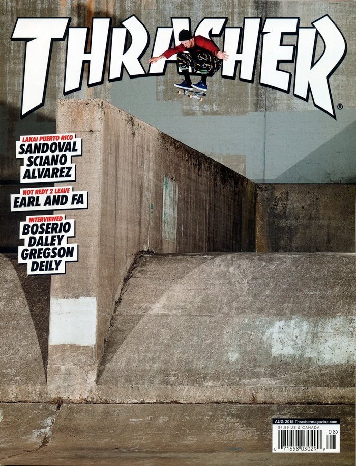
The inspiration for this photoshoot was from the photography used on THRASHER a competing skating magazine. 

Image result for thrasher magazine

The reason this image fits into the codes and conventions of an extreme sports magazine, is because the the subject of the image is a mid air shot of a preforming skater. The angle is made more extreme through the use of a fish eye lens, which is often used in extreme sports magazines photos. The setting of the image is a also a place which is rural and concrete, connoting the feeling of the skating sub-culture in cities like Sheffield. This fits with THRASHERS style of magazine, since they are usually featuring a certain area as well as featuring a being interviewed. The persons outfit also is the type of outfit that people who are interested in extreme sports wear, or how the audience aspire to be like, which is what magazines like Thrasher always ensure, in order to attract a specific audience who dress a certain way. Although the difference is that you can't see the sky in the real example, the sky gives the image a very beautiful and visually appealing style. This hopefully should make the magazine appeal even more, since it is very popular to enjoy great photography.


This is the second picture I will be using for the magazine. The picture depicts Sheffield's city landscape, with the sun setting in the background. This fits with the proposal I wrote, since I had decided to make Sheffield an appealing place for skaters, which I have completed through capturing the image using a quick shutter speed and a wide aperture, in order for everything in the image to be in focus, and in order for the image not to be overly exposed, which is a rip when taking photographs of the sunset. 


This is the second picture I used in the magazine. The picture also depicts Isaac Green jumping over the ramp, however he is further ahead in the jump in the shot. Again a fisheye lens has been used.


Image result for thrasher magazine


Just like my image, in this image which is taken for Thrasher features a skaters (extreme sports) peforming an impressive jump, aswell as wearing clothes which the target audience wear, as well as also featuring a skate park. The sky has also been used to visually show the freedom that skating can offer. When editing the magazine I intend to have the skater layering over the mast head since it shows that the skater is jumping really high, and is a creative way of breaking the fourth layer in a way, as it connotes that the skater is almost jumping out of the magazine. Also, the mode of address for all the photos are peer to peer, since the situation when you see someone on their skating is incredibly casual and is not formal in anyway, therefore the reader feels a sense of social acceptance and familiarity when seeing these images which creates a pleasant experience for the reader.


BODY COPY FOR DOUBLE PAGE SPREAD:

Quick Fit is a skate spot like no other. The abandoned area was taken advantage of by local residents of Sheffield and transformed into a DIY spot, allowing skaters to build and modify  the area in anyway which is good for shredding. In the shot below you can see Isaac ollying of a mini ramp, made out of a metal slab placed on top of square rock, a good example of the type of ramps that are created at Quick Fit.
So you’ve been skating for four years now?
Isaac: Five actually, I started when I was 12.
Five years, thats insane, where do you think you would be now if you never started skating.

Isaac: Wow, thats a wierd thought! I’m not sure but I recon I would be pretty bored, skating’s a big part of my life.
I can tell, Judging by those stunts you’ve just pulled I can see its something you’ve really put a lot of effort into.
Isaac: I wouldn’t describe it like that, skating isn’t really something that needs effort, I usually associate effort with things that I’d rather not be doing...

Well I guess skatings more of a passion to you then?
Isaac: For sure! Shredding provides the freedom of movement.
So why do you skate at Quick Fit so much?

Isaac: Quick Fit is by far my favourite spot, I love that you are able to change and set up random debris to aid your skating exeperince, plus the whole place has a really rural feel which I think is unique to Sheffield.
What makes Sheffield such a great place for skaters?
Isaac: The range of places you can go to, like staying in the same area can become quite dull, but in Sheffield theres plenty of different places to go and skate.
How long does it take to progress to you level of skill when it comes to skating?
Isaac Ah thats a hard one, the thing is it depends on the individual, like I know some people who start skating and take to it easily! While others, not so much.
Fair enough man, thanks a load for talking being on NO COMPLIE take it steady Isaac Green.


The mode of address for this article is peer to peer, since like articles I have have read in a skate magazine they are written in a very laid back and relaxed way. This way the reader feels as if they are getting to know the skater being interviewed, which is an exciting experience for the right type of audience, since they either admire Isaac and want to be like him and skate like him, or they see him as an ideal partner. The article also describes skating in a way which is designed to almost advertise the sport of skating, meaning that they are going to build an attachment for the brand NO COMPLIE since they will remember that brand to be the one that got them into a new sport. The magazine also advertises the city of Sheffield, and why it is good for skating, which is what I intended for the magazine to do, in order to visit Sheffield and become a part of it's skating sub-culture.

THRASHER's EDITORS NOTE:


In this editors note for the skate magazine THRASHER Kevin J. Thatcher has written an editors note in a peer to peer mode of address, which both entertains and inspires the target audience of skaters, it also uses the informal type of language that is related to the sub-culture of Skating such as spot, referring to an area where you can skate.


Considered editors note:

Uses peer to peer mode of address.


Final editors note:

Welcome my dudes, to the very first issue of 
NO COMPLIE, where you will find jaw drapping pictures of skating and BMX, followed by interviews, tips and tricks, all local to Sheffield! Through this I hope you can all impove your extreme sports abilities!


Keep on shredding!


Sunday, 15 January 2017

LO3: Setting up Adobe InDesign CS6


The reason I made my magazine the size the it is was in order to compete with Thrasher, who's magazines are larger in order for the magazine to be more portable in order to be more convenient to the sub-culture of skaters in Sheffield, since they are always on the move, they are likely to want a magazine which is easy to carry. The reason the bleed is the size that it is is because I wanted to magazine to be the size of a real magazine.


Saturday, 14 January 2017

LO3: Setting up Adobe Photoshop CS6


In this screen shot I am setting up the page for my front cover. I decided to use Photoshop for this task because it was more flexible for editing photos, and this page didn't need to include an article, which is what Adobe Indesign is helpful for. The sizes I used are similar to the real life magazines which are portable.

Friday, 13 January 2017

LO3: Body copy for articles

Quick Fit is a skate spot like no other. The abandoned area was taken advantage of by local residents of Sheffield and transformed into a DIY spot, allowing skaters to build and modify  the area in anyway which is good for shredding. In the shot below you can see Isaac ollying of a mini ramp, made out of a metal slab placed on top of square rock, a good example of the type of ramps that are created at Quick Fit.

So you’ve been skating for four years now?

Isaac: Five actually, I started when I was 12.

Five years, thats insane, where do you think you would be now if you never started skating. 

Isaac: Wow, thats a wierd thought! I’m not sure but I recon I would be pretty bored, skating’s a big part of my life.

I can tell, Judging by those stunts you’ve just pulled I can see its something you’ve really put a lot of effort into. 

Isaac: I wouldn’t describe it like that, skating isn’t really something that needs effort, I usually associate effort with
things that I’d rather not be doing...

Well I guess skatings more of a passion to you then?

Isaac: For sure! Shredding provides the freedom of movement.

So why do you skate at Quick Fit so much?

Isaac: Quick Fit is by far my favourite spot, I love that you are able to change and set up random debris to aid your skating exeperince, plus the whole place has a really rural feel which I think is unique to Sheffield. 

What makes Sheffield such a great place for skaters?

Isaac: The range of places you can go to, like staying in the same area can become quite dull, but in Sheffield theres plenty of different places to go and skate. 

How long does it take to progress to you level of skill when it comes to skating?

Isaac Ah thats a hard one, the thing is it depends on the individual, like I know some people who start skating and take to it easily! While others, not so much.

Fair enough man, thanks a load for talking being on NO COMPLIE take it steady Isaac Green.


Wednesday, 11 January 2017

LO3: Contact sheet and Evaluation

Here is the contact sheet for the photo shoot. The image of Isaac Skating will be used in the magazine. Images of Isaac Green were also taken in case they could be included in the contents page. Many pictures were taken of the sun setting also. Certain pictures such as IMG_6456, IMG_6458, IMG_6459 can not be used because the images are over exposed and wouldn't be suitable as they have a rubbish appearance.

Images 1 and 4 can be used however 2 and 3 cannot.

STRENGTHS:

The images fit the brief, since they were taken in a sunny environment, and were taken in a rural area local to Sheffield. They also feature an experienced skater who can be considered an ideal self or ideal partner for those who submerge themselves in the sub-genre of skating.

Image 6461 was taken in a high quality raw format, meaning that the image can be edited in a more successful way, and will create more of a spectacle, since I will be able to bring the colours out more, and make the skaters surroundings appear more beautiful.

There are other images of people bmxing and images of Sheffield's landscape, which can be used in other sections of the magazine, since the brief states that the magazine has been designed to create an appeal to Sheffield to mostly skaters but also bmxers.

WEAKNESSES:

The images do not have much range, meaning I have a limited choice of images to choose from when editing the magazine together,

Some of the images are blurry, and will not look professional enough for the magazine.

Four of the images are overly exposed, and are completely useless for the brief, since they are not very clear in their appearance.